Almost 11 years as a professional in this industry has taught me that most investors rarely think their arguments to the end and apply statistics in a questionable way. Recently several leading news media and key people in the industry have floated the chart below, showing the subsequent 10-year annualised return from a given starting level of 12-month forward P/E ratio on the S&P 500 using data since January 1992. The line marks the current 12-month forward P/E ratio just below 22. Several market commentators have used the regression line going through zero return based on historic data to indicate that US equities offer a poor risk-reward ratio. But the statistical truth is that the prediction interval around these points is quite wide and that the 10-year annualised return from the current level could be anything from -2% to +5%. In other words, the valuation level alone is not worth much except as a ballpark estimate of what lies ahead.
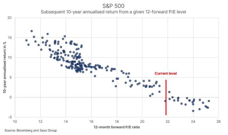
Another important thing to consider is that the current Q1 earnings season has shown that analyst estimates have been too conservative. It could be that the current 12-month forward P/E ratio is way off if those earnings expectations fail to model the massive impact on earnings growth from the current fiscal regime. As you can see, there are many variables at play in such a simple chart.
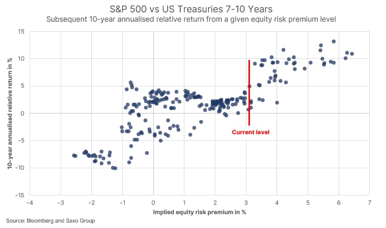
The next level analysis is to recognise that equities do not behave in isolation but is part of a complex financial system where the most prevalent alternative is bonds. If take the inverse P/E ratio we get the earnings yield, a crude proxy for the implied equity return, and compare it to the yield-to-worst on 7-10Y Treasuries then we get a simple implied equity risk premium. This simple model fails to incorporate earnings growth as the inverse of the forward P/E ratio gives you the perpetual earnings yield. Leaving that aside for a moment, because it does derail our point, we can now compare the implied equity risk premium to that of the subsequent 10-year annualised return between US equities and US 7-10Y government bonds. The implied equity risk premium is basically measuring what we can expect in terms of equity returns over bond returns given the current equity valuation level and prevailing bond yield.